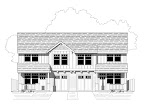
If you've seen Istockhouseplans' portfolio lately, you may have noticed a pattern. We're pretty crazy about historic styles. Large wood, texture, built-ins, house bling, etc. all play a part in the way we design. But our design only covers part of the scenario. We can design all we want, but the final product is left to the builder. We can spec out materials and such but the fact is that the permitting jurisdiction only cares about structural and code issues. As well they should. Historic review boards will care about such matters. In fact, we were recently privileged to sit in on and testify in front of a historic review board for a private commission we are working on.
While the historic review board was amenable to both historic-ish styles and the builder's pocketbook, we were a little disappointed that they didn't even discuss certain issues. Some of these we think are crucial to distinguish between a true classic and a blatant reproduction. While we mentioned some key issues a few years ago, we think that there are three that should always occur on a reproduction or historic remodel:
Windows. Look at an old house. Where are the windows located? They are generally inside the wall. Now look at most new homes and answer the same question? The windows on the outside of the wall. A little 2-3" nudge makes a huge difference. So how do you install a new flange window inside the wall? One way is to frame your openings 3" larger each direction and then install a 2x4 subframe inside the 2x6 frame. The window then gets mounted to the subframe and floats inside the wall a few inches. Cut down on all the extra wood by integrating the 2x4 subframe as part of the structural load path. Another option is to purchase tip-in style retrofit windows. Cost may be a factor in this case.
Siding. Have you ever wondered why a substandard recladding of an old home looks so disappointing? Think texture and relief. First, old homes did not have one type of siding. Two are minimum. Even if both styles are lap and the difference is 4" vs. 8" reveal, it can make a house pop. The biggest problem in our opinion is the relief of fiber cement lap siding. How thick is the bottom edge of yesteryear's lap siding? Darn near 1/2". Now look at the specs of Hardi-plank. How thick? 5/16", barely more than 1/4". the stuff might as well be flat. That tiny little edge looks puny, like trying to do 5/4x6" bargeboards. Hey Mr. Hardie! Have you ever considered putting a lip on the edge of that stuff to give it a stronger look? If we ever get to build, we will not use that stuff. Who cares if it lasts 100 years. That's 100 years of puny looking disappointment. "What will you use then, tough guy?" What indeed. Glad you asked. Wood. Wood lap siding with a 1/2"+ edge to it that makes the house look like it has been around forever. Prime 6 sides and paint the visible sides. Lots of work, yes, but the result is amazing and the durability just as good as Hardi.
Roofing. It used to be (back when I was a boy!) that the roof color was complementary to the color scheme of the house. Light grays, browns, even red, blue and green asphalt shingles gave interest to the color scheme below. Now it seems that most new homes are similar to the Model T. "Your roof can be any color you want, so long as it's black. Because I bought 3000 squares and I have to get rid of it..." Why are new roofs black anyway? Is it because there's some aesthetic about a sharp contrast to one of the 3 shades of camel that new homes are colored? We think it looks like a thick heavy black cap that smashes the house down and makes it look foreboding. It also invites heat to be absorbed into the attic. If you're building new historic or renovating, please don't use black.
If anybody out there can answer our concerns, we would love to hear. Add a comment to this blog and set us straight.
Tuesday, September 21, 2010
Subscribe to:
Post Comments (Atom)


No comments:
Post a Comment