
The APA (Y'know, the plywood people) recently unveiled a new video outlining advanced framing and how easy it is to achieve in your building. If you're still building at 16" o.c. with redundant studs at corners, windows, and T-walls, see this video. These techniques actually ask you to do LESS in your building while achieving cheaper costs, a more comfortable home, environmental friendliness. If you still balk then I won't stop you from building substandard home. But for the future of your income, please at least consider staging these techniques into your repertoire of framing practices.
By way of reminder, it's not the number of studs that keep your house from blowing down or siding from warping, it's the use of plywood gapped per manufacturer's specs that achieves strength and durability.
Showing posts with label thinking outside the box. Show all posts
Showing posts with label thinking outside the box. Show all posts
Friday, December 13, 2013
Tuesday, June 18, 2013
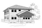
Garage to ADU Conversion Problems
When doing math it sometimes gets tricky in the conversions. How many litres in a pint? How many centipedes in a decibel? Likewise it can get tricky converting a garage to an ADU. Let's pretend that your local jurisdiction is not an issue and look at the inherent problems. (Note, please always consult with your local jurisdiction and get a permit where required.)
The first issue would be the floor. Most contractors would be happy to leave the floor as a slab and call it good. Maybe put a carpet over it. Nothing could be worse. You have no idea what's under that slab. It could be sand, gravel, or bare dirt. There may or may not be a vapor barrier under there either. Concrete is nothing more than a rigid sponge. Placing a carpet over the top just gives latent moisture somewhere to make dank and moldy. Don't do it.
Instead, consider laying some 6 mil vapor barrier down over the slab first. There is likely no insulation under there either so a few inches of rigid foam insulation would help to keep the dewpoint away from your materials that are susceptible to mold. After making sure all joints are sealed, overlay with a floating wood floor. Looks nice too.
Hopefully walls and ceilings would be straightforward. Always check for and mitigate any moisture in the walls, make sure the wiring is correct, and get inspected if necessary before applying sheetrock. Fill the space with insulation before making it inaccessible.
Another big issue to consider is the street appeal. The general rule of thumb is to throw some sort of window into the former garage door opening and frame around it. This looks wrong on several levels. First, the garage door header is generally not equal to other windows or doors. If the garage is freestanding then this is less of an issue. But if the garage door is near other windows and doors it can look discontinuous.
The expensive option is to cut out the header and make it the same as other headers on the front of the house. Another option would be to consider something such as two 3/0x5/0 single hung windows. The vertical aesthetic of the windows can help soften the horizontal issue. Another option which happened near here was to remove the garage door but build an inside wall that looks like a garage door from the outside. Windows were already on the side of the garage. This looked really nice. Unfortunately the local jurisdiction in all their wisdom required a window in the front. In vulgar terms it looks really dorky now. Perhaps a sliding glass door could be considered as another option.
Another issue that can come up is the parking space. If you have less than 16' in front of your garage to begin with you may lose an onsite parking space. Some jurisdictions might think this a big deal. Others won't. A driveway going up to a blank wall does not fool the eye. We have grown to expect a garage door at the end. If that garage door is gone then the driveway needs to be reimagined in order for the eye to accept a wall at the end.
If there is room then landscaping or a bench will help soften the transition. The amount of concrete in the driveway could also be reduced. Leave a couple of 30" strips with 24" between them. Everything else should be returned to grass or other low, resilient plantings. If your budget allows, put in driveable molds or spaced pavers that allow grass to grow in between them. Some folks may not appreciate the look of parking a car in grass but it may suit others' needs.
If you are converting a garage into an ADU, Istockhouseplans would be pleased to give advice. Send us an email or leave a comment below.
 |
| Looks normal but the owners want more living space |
The first issue would be the floor. Most contractors would be happy to leave the floor as a slab and call it good. Maybe put a carpet over it. Nothing could be worse. You have no idea what's under that slab. It could be sand, gravel, or bare dirt. There may or may not be a vapor barrier under there either. Concrete is nothing more than a rigid sponge. Placing a carpet over the top just gives latent moisture somewhere to make dank and moldy. Don't do it.
Instead, consider laying some 6 mil vapor barrier down over the slab first. There is likely no insulation under there either so a few inches of rigid foam insulation would help to keep the dewpoint away from your materials that are susceptible to mold. After making sure all joints are sealed, overlay with a floating wood floor. Looks nice too.
Hopefully walls and ceilings would be straightforward. Always check for and mitigate any moisture in the walls, make sure the wiring is correct, and get inspected if necessary before applying sheetrock. Fill the space with insulation before making it inaccessible.
Another big issue to consider is the street appeal. The general rule of thumb is to throw some sort of window into the former garage door opening and frame around it. This looks wrong on several levels. First, the garage door header is generally not equal to other windows or doors. If the garage is freestanding then this is less of an issue. But if the garage door is near other windows and doors it can look discontinuous.
 |
| Slap in a window. Well, it's functional at least. Yeesh. |
The expensive option is to cut out the header and make it the same as other headers on the front of the house. Another option would be to consider something such as two 3/0x5/0 single hung windows. The vertical aesthetic of the windows can help soften the horizontal issue. Another option which happened near here was to remove the garage door but build an inside wall that looks like a garage door from the outside. Windows were already on the side of the garage. This looked really nice. Unfortunately the local jurisdiction in all their wisdom required a window in the front. In vulgar terms it looks really dorky now. Perhaps a sliding glass door could be considered as another option.
 |
| This looks a little more purposeful... |
 |
| A cabin perhaps? May or may not work. |
Another issue that can come up is the parking space. If you have less than 16' in front of your garage to begin with you may lose an onsite parking space. Some jurisdictions might think this a big deal. Others won't. A driveway going up to a blank wall does not fool the eye. We have grown to expect a garage door at the end. If that garage door is gone then the driveway needs to be reimagined in order for the eye to accept a wall at the end.
If there is room then landscaping or a bench will help soften the transition. The amount of concrete in the driveway could also be reduced. Leave a couple of 30" strips with 24" between them. Everything else should be returned to grass or other low, resilient plantings. If your budget allows, put in driveable molds or spaced pavers that allow grass to grow in between them. Some folks may not appreciate the look of parking a car in grass but it may suit others' needs.
 |
| Sweet Stickley, can we live here? That bay, that driveway. What lovely lines! |
If you are converting a garage into an ADU, Istockhouseplans would be pleased to give advice. Send us an email or leave a comment below.
Thursday, August 23, 2012
Space Saving Ideas
Apologies for the month of silence. We've been on vacation a little a getting more business than we've ever been used to. Totally. Awesome.
But this caught our eye. There are some ideas that are a little vain but for the most part here are some practical and ingenious ways to use space in your home. We especially love, love, love the stair landing with the trapdoor. The fact that under the staircase is open is even better as it would make a small space feel larger. Plus it's available for any use you can dream of.
The sawhorse dining table is rather cool too.
 |
| Open + storage + wainscoting = win! |
Tuesday, November 8, 2011
IKEA Loves Small Homes
If you've received your copy of the 2012 IKEA catalog, you may have noticed a theme. We at Istockhouseplans were thrilled to read the phrase on the front: "A HOME DOESN'T NEED TO BE BIG, JUST SMART." Bravo IKEA, bravo!
The first couple of pages immediately show some ideas that the IKEA design team put together. They created a space for 6 friends to live in within 430 square feet. The solution consists of curtained bunkbeds at the edge with a large table in the middle. All other space is communal.
Their second challenge was a 75 square foot kitchen. IKEA was able to get an island and plenty of storage in the small space. Other layouts are shown starting on page 112. If these still aren't inspiration enough, you can go to IKEA's website and use their kitchen design software.
The next challenge was a 118 square foot living-slash-bedroom-slash-playroom. The central feature is a loft bed for the grown-ups. Another variation is shown in a 107 square foot living room that is essentially a showcase room for a chaise lounge.
The final design involves a 29 square foot bathroom - with laundry space and a spa tub. There must be some smoke and mirrors here because no good ol' 'Merican spa tub would be less than 29sf itself, right?
To see videos showcasing all of these ideas, visit IKEA-USA.com/smallspaces.
The coup de grace of all of this for us was the new Lillangen single bowl sink. One of our favorite things is to make secondary rooms (powder baths especially) as small as possible. Building code dictates some minimum sizes needed around fixtures. At some point to get smaller, the fixtures need to shrink. We can specify a smaller sink only to have the contractor turn it down because of cost. (Why are smaller appliances, fixtures, and doodads so much more expensive anyway?) IKEA's previously mentioned sink is less than 11" in depth with a side faucet (faucet sold separately). Price for the ceramic, $49.99. Price for faucets starting at $39.99. Less than $100 to reduce the size of the house, or give that space to another use.
Of course this is all good news for our line of tiny homes. If you try to design a tiny home as a mini-McMansion you will fail. But with IKEA and a little ingenuity you can make anything happen.
*Full disclosure: IKEA has no idea I wrote this blog post.
Thursday, March 17, 2011
Luck of the Irish...
...Is about the only thing that allowed this post to go out today.
Here's a wee little number that might get your knickers straightened out. Istockhouseplans finally released the flagship of flagships to our stock plan pile. We mentioned a while ago that this monster was coming out and this represents the last of the behemoths. Everything else we release from now on should be around 1500sf or smaller.
The Goose Hollow 3242 is larger than the motherland and comes with a neat twist. Instead of the expected 2,688sf based on dimensions, it comes in at 2,332sf. The footprint is virtually square. But like a doughnut, there's a hole in the middle and it goes clear through. We had this great idea for a courtyard home that would fit on a standard (nay even substandard lots). At 32' wide it could fit in 42' of urban space. Several iterations were tried but most became unwieldly. This time around we took some prior inspiration and mingled it with our holy idea. What results is a large house with 4 bedrooms, 3 baths and lots of conditioned space - plus a neat little outdoor space.
There's not much more to say other than to ask you to check the plan out online. Give us your thoughts on this pierced plan.
Tuesday, December 14, 2010
Some comments on Real Estate Agents
First off, we want to say that we appreciate realtors very much for the upstream job they do in selling our plans. Granted, they don't sell our plans directly, but they do sell the building that the contractor created from our plans. But there are some things that we'll never understand. Most likely this can just be chalked up to personality types, life direction, etc. Sort of like we will never understand the Chinese culture. If you are a realtor, we invite you to respond with intelligent answers in an attempt for open communication.
1. Why does all of your marketing material have your face on it? Why do we care what you look like? Some of you are not very attractive, even with glamor shots and PhotoshopTM. Maybe you say it's because your face is your image and it's how people remember you. We think you guys all look the same. Same with insurance agents and lawyers. But the contractors who build our plans don't advertise with their face. As building designers, we don't advertise our face (we know better!). Plumbers don't, electricians don't, and the guy who lays the carpet doesn't. So why do you? Is this the way it's always been done? We'll bet if you used something other than your face, you might get noticed as being unique. Just a thought. Maybe an icon of a house with some zoom lines around it that says "I make quick sales". That's what we really want anyway, not your face on a lawn sign.
2. I understand that not anyone can get a realtors license. You've got to have patience, a study guide, and $500 to take the test. So why on the test do they not mention anything about house styles? I swear, every other house listed in our local paper is a 'bungalow'. I know for a fact that there are not that many bungalows in the state. Is a bungalow sexy or something? Or is it just a cop-out because other housing styles aren't known? We've seen tudor, craftsman, prairie, ranch and victorian all listed as bungalow. Another one that crops up is 'old Portland style'. What!? Which style? This one really is a cop-out. It's used a lot on prairie cubes and bungalows where the word bungalow has been already overused. If I may suggest, could you research housing styles and figure out more than five?
3. Why did we receive junk mail and solicitations AFTER we bought our current abode? Did you think that we would be so impressed by a circular with your face on it that we would immediately want to buy another home? Like we could afford that? Instead, the timing of your mailer was so backwards that we looked at it, made fun of the timing, and then recycled it without another thought. No, I don't know who it was, you all look the same. It would be understandable if Istockhouseplans chose to leave catalogs on construction sites. Builders tend to build more than 1 house every 3-5 years.
4. Maybe the general public can't tell, but some of your fliers for houses are less than spectacular. The fliers themselves sometimes use gaudy colors or err on the other side of no bling at all. AT ALL. We do want to see more than a list of 'amenities' in 10 pt font and 4 1"x1" photos of the house. But we don't want to see what looks like a beginner's guide to every option in Print ShopTM. A simple left margin graphic, 3 colors, and appropriate font size are a good place to start. And make the price tag big enough that it can be seen through the 'take one' flier box, in the rain, from the car, at the curb. We are not pleased with having to open the door in a downpour to grab a flier (or 110 degree temps for those in SoCal). The mere act of touching a flier will not increase the chances of buying a house. Folks who are driving through a neighborhood they haven't been through before do not want to write down an address to look up when they get home. They'll forget. Or they will merely go the next house with a post and shingle and look at the flier through the glass. If they feel they can afford it, they'll risk the elements to grab a flier.
5. Photographs. This should be 'nuff said. First, include them. When a flier says 'Too new for photos', this is immediately understood as laziness. "But I just have to get signs and an RMLS listing up today!" Good, go get some photos first. Years ago we saw a website of a realtor who was making fun of other realtors for their photos. If you can be seen in the bathroom mirror as you run by to take a photo, it's worth a retake. If the neighbor's trashy car is visible through living room windows, it's worth a retake. Second, please stage your photos. This does not need to be spendy. Clutter in the house MUST GO. Make your client clean up, get a storage space, or explain to them their house will take 6 months to sell. Being able to spot a box of 'toys' in a master bedroom photo will make us ask for new carpet. Just in case. No, steam cleaning won't be enough, thank you. And lighting is a must. Invest in some shop lights on a stand and use them for INDIRECT lighting. Perhaps you could consider a fish eye lens. Nothing dramatic, but have you ever tried to photograph a small bedroom or bathroom? It's almost impossible to see the whole thing. A subtle fish-eye style lens with 120+ degree views could help. A lot.
Now we understand that home designers giving sales advice to realtors is similar to realtors telling us how to design houses. So be it. Consider this to be some helpful advice and tips from our years of experience in the housing industry. Feel free to leave comments. If you'd like to discuss more, email us. Without your face.
Tuesday, September 7, 2010
I curse you... thinner!
As if taken by some inexplicable force, Istockhouseplans has become more and more obsessed with smaller and smaller homes. Our latest release is sure to boggle the mind.
The Cascadia 1052 was contrived after looking at a typical 15' skinny house the wrong way. The massing portion appeared to be only 10' wide and seemed reasonable. "What the hey, let's see if it will work!" It, um, did. Sort of. We made a 3 bedroom, 1.5 bathroom home in 1009sf and 10' wide. It's kind of like a shotgun house except it's 2 stories. So it's more like a single barrel shotgun with a massive sniper scope. Give it a look and tell us what you think. If the reaction is generally positive, maybe we'll try another iteration. If the consensus involves torches and pitchforks, we'll drop the price. If there's no reaction whatsoever, we'll go out for beers.
Speaking of which, the first person to build these plans gets a free 6-pack, on us.
Tuesday, August 24, 2010
May We Suggest?
From time to time Istockhouseplans receives questions about our plans. Some feel that we are too light with our information, not including enough detail. If this sounds like you it's quite possible that you have worked with an architect in the past. Architects are quite notorious about detail. As we noted earlier, we are not those architects. A colleague said something very true the other day. The quote mostly follows, "My plans are more of a suggestion. It's up to the builder to take care of the details." While this may sound arrogant or lazy, we see real value in this statement.
We have tried filling detail into plans only to have it ignored. A good example is stairs. If you are site-building stairs, there are at least three ways to build the carcass, at least three ways to attach the treads and risers, and at least three ways to attach a finish material. Right there are 27 ways to build stairs. We see no need to include every possible detail. You as a builder are going to build stairs the way you have always built stairs. If the situation messes up your usual way of doing things, you'll figure out a way on your own based on your own experience.
The same goes for detailing exterior trim. This is why our houses look fairly plain. All of our homes are drawn with typical 6" lap siding except for the occasional board and batten or shingle pattern. Don't like it? Change it, we don't care. If you want to throw T1-11 all over it, feel free (but for heaven's sake, don't tell us, send pictures or advertise it as our plan!) Don't like the kitchen layout? Fine with us, talk to an NKBA professional. Porch too small/big/unattractive? Have a beer, peruse a magazine, and design your dream porch suitable to your region. It's all in your hands.
Or put it this way: Our house plans are like a cooking recipe. Add more meat, change the veggies, and spice it up a notch. Throw in your own special ingredient, change the heat, or create a redux to simplify the whole thing. (FYI, cooking is a side hobby in the office kitchen).
We feel it is our job to create some space layout, flow, and basic structural capacity. But the rest we leave to you. If we feel something is important to a particular look, we might detail it out. Send us an email and we can give some more suggestions.
Tuesday, August 3, 2010
Tiny Housing and Where to Stick it.
As you may know, we have been more and more interested in designing tiny houses. Michael Janzen at the Tiny House Blog recently posted a good article detailing how to find land to build your tiny house. Though many places have restrictions, there are more that do not. Michael is from California and writes from that perspective. Istockhouseplans gave an Oregon perspective. The main points of the article are:
1. Avoid building codes
2. Camp on your land
3. Alternate Zoning
4. Trailer Park
5. Build an Ecovillage
6. Move to the countryside
7. Camp in a friend's backyard
8. Hide in plain sight
9. Seek a variance
Our reply and additional information for Oregon:
Oh boy Michael, I think this is a big can of worms. Pardon, in advance, the long post that I feel is coming. I am familiar with Oregon Building Codes (based off of IRC) and many of the greater Portland area municipalities’ zoning codes. I write from this perspective.
States that have building codes truly are protecting folks. The code and inspections ensures that the house is being built safely. Moreover, room size minimums are to be sure that unscrupulous builders do not create 1000sf 5 bedroom (3 of which are 6′x5′ without a closet) homes akin to tenement housing. This is accountability and guides consumer expectations. I do realize that consumers have been conditioned to expect a small bedroom to be 10′x11′ and the previous example would probably not sell.
The codes also are in place to protect firefighters in rescue situations. I recently was privileged to listen in to the Oregon State Code Board and their revisions to our next code update. Most of their structural concerns were with firefighter safety. A floor over a basement collapsed last year due to structural inadequacy, causing the death of a couple firefighters. Windows are important too. You may be able to squeeze out of a 2′x2′ opening, but if you are unconscious, you will appreciate having a 5.7sf opening that a firefighter can get into, pack and all.
Oregon has minimum room sizes (70sf) and ceiling heights (7′ +/-) but these can be ignored if you are building the house yourself (contractor’s license not required) and will be living in it for at least two years (not selling it right away). The Carver series of homes on my website plays with this notion. All three homes are less than 300sf. Two have ‘legal’ rooms and the third ignores that standard.
I don’t believe that any jurisdiction in Oregon regulates minimum house size. These restrictions are generally put in place by upper scale housing developments with HOAs. You probably don’t want to live there anyways. Accessory structures are allowed without a permit in most zoned areas if they are 120sf and less. Oregon has increased this maximum to 200sf.
Camping on your land near municipalities is generally allowed but carries a rule of no more than 30 days in any 6 month period and cannot be closer than 3 miles to an established city (Clackamas County, some rural zones). I understand the idea is to keep transients from mucking up areas. Oregon apparently does not like it’s transients.
Your idea regarding multi-family is a great idea. Some of the zones around Portland allow for separated structures, but some require attached units. City of Portland has a minimum amount of units to be built on a piece of land. For instance, a 100′x100′ parcel in R-2 zoning requires a minimum of 4 units. They must all be built at the same time or within a couple years of each other.
Variances can be sought around here, but require several things. The first is that you must get approval from a percentage of neighboring properties within a certain radius. The second is that you must prove a hardship in order to apply for the variance. Most of the time, the use must not preclude the base zone use. For instance, trying to get a house built in an EFU (exclusive farm use) zone has several restrictions. The land is considered high quality and reserved for crops.
Setting up as an ADU is generally encouraged by the City of Portland and most other jurisdictions. Portland has even reduced their fees to create an ADU. Clackamas County will only allow one kitchen on a piece of property.
I like the idea of hiding in plain sight. I was recently looking at a piece of land that was 30′x1300′. This was a county owned property that was being auctioned off at a starting bid of $1048. It was zoned for farm use only, but allowed buildings that were incidental to farm use. My thought was to use the land as my own personal garden and orchard. I would build a 198sf (avoid permits) cute (neighbor appeal) ‘processing shed’ (incidental to farm use) and use that as a tiny cabin. My family of four would spend weekends there. In the fall, we truly would use the bed platforms to process bushels of apples.
My best option for a permanent home would be to purchase one of these substandard county parcels through auction that was zoned for housing. These parcels are considered substandard because they won’t fit a 40′ wide home and are therefore sold for 4 digits as opposed to 5 or 6. Many rural properties around here want a 10′ side setback. With the previous 30′ wide property (were it zoned residential), that would allow for a 10′ wide home, plenty wide enough for me to work with (and allows for the minimum 7′ wide rooms). In fact, cantilevers are allowed that would allow some rooms to be wider than 9′ inside.
Problem is that while I would spend $1000 for the land, I would end up spending $5000 or more for a well and $10,000 for a permit. I would install a composting toilet and avoid the septic cost. I do the building myself and after all costs are considered, I’m in a permanent legal place of 600sf for around $40k. This is acceptable to me but I know that others will be wanting to do the whole package for under $10k.
My other option was to enact the camping clause, drag a 28′ trailer to the site, and build a tiny home on it. Maybe even with pallets!
I hope this helps some of your readers who live in other parts of the country to explore their local codes and see what they can pull off.
Tuesday, June 29, 2010
Anorexic Architecture
Our current fascination with tiny homes started with one dimension only. Several years ago we were patrolling the web for skinny homes. Not just skinny homes, but the skinniest homes in the world. Our thought was in trying to cram as many homes as possible onto a 50x100' wide lot, assuming zoning allowed. Given that 5' setbacks are typical, we figured there would be a 40' wide footprint. Most folks would say 2 attached 20' wides would be typical. We are currently working on a 3-16' wide building. But you could easily do 4-10' wide houses. Crazy? Consider that building code requires a minimum 7' wide room in homes and you could cram 5-8' wide homes onto that lot.
But history has brought about some even skinnier homes. Boston, MA and Alameda, CA have their 10' wide homes. In Alexandria, VA is a skinny house that was built to close off an alley. The home is 7x25' and two stories tall. In the Montlake neighborhood of Seattle, WA is a house that, while 15' at the front, is 4.5' in the rear.
The most notorious of all skinny homes was the so-called Richardson Spite House at the corner of 82nd St. and the newly punched through Lexington Avenue. Built to spite his neighbor for an insultingly low offer for his 5' sliver of land, each of the two houses built contained 8 suites each which rented for $500 per year.
While we don't recommend building strange homes to spite your neighbors, we are interested in designing homes for lots that seem unbuildable. If you own a piece of property that seems too difficult to build on, contact istockhouseplans and we'd be happy to design a home for you. We appreciate the challenge of taking the zoning and building codes to their limits. Don't be fooled by our stock skinny offering. We can make this thing look like a wide mouth bass.
Tuesday, March 30, 2010
Advanced Placement
Energy Trust of Oregon in their never ending quest for energy efficiency in that great state recently introduced their new incentive path for homes. Called Advanced Performance, this path breaks the bar in many ways. Most of us are used to designing and building 2x6 walls. This is going to be a bit of a challenge now. And we're not going to get to do post and beam floors anymore. Here are the specs:
This isn't your Father's energy efficiency path. This is some serious action going on. We at Istockhouseplans are rather excited about this path and would love to help your home achieve it. If you'd like to build any of our plans to this standard, we would be happy to modify it for free. That's right. As a program ally of Energy Trust of Oregon, we'd be so excited to see a home like this get built that we'll do what we can to make it happen. Contact us if you'd like to learn more.
- Framed floors: R-38 joisted (P&B results in leaky floors and/or saggy insulation)
- Slab floors: R-15 full slab with perimeter break
- Walls: U-0.025. This means R-40 assembly, not just R-40 insulation. Either thicker walls or better insulation is required
- Windows: 15% of floor area, U-0.22 weighted average
- Doors: R-5
- Ceiling: U-0.016. Like the walls, this means R-60 assembly, not insulation
- Heating: 8.5 HSPF/13 SEER or better ductless inverter driven heat pump
- Ventilation: HRV/ERV with 70% sensible recovery efficiency
- Tightness: 2.5 ACH50 or better
- Lighting: 90% CFL
- Incentive: $4,000 plus state and federal tax credits
This isn't your Father's energy efficiency path. This is some serious action going on. We at Istockhouseplans are rather excited about this path and would love to help your home achieve it. If you'd like to build any of our plans to this standard, we would be happy to modify it for free. That's right. As a program ally of Energy Trust of Oregon, we'd be so excited to see a home like this get built that we'll do what we can to make it happen. Contact us if you'd like to learn more.
Tuesday, March 2, 2010
Free Green at Last, Free Green at Last!
Apologies for being absent for the last month. We were busy working on our entry for the FreeGreen Who's Next? design contest. The contest has 2 profiles, one for yuppies and one for retirees. We chose the yuppies and designed a house that could grow with them. Our design utilizes a 2 bed 1 bath home in 1000sf. There is an approximately 400sf finished attic that is ready for partitions (more bedrooms?). The most exciting feature of the home is the rear deck. It's built on a foundation that can support a future 336sf addition. Simply pull up the deck and build the house!
Competition is hot and heavy with 247 entries. Early voting shows us nowhere near winning but it is early. We're amazed by the number of houses that don't look like houses. If you think Istockhouseplans has got what it takes, show us your support by voting.
Thanks and we'll see you soon!
 |  |
Competition is hot and heavy with 247 entries. Early voting shows us nowhere near winning but it is early. We're amazed by the number of houses that don't look like houses. If you think Istockhouseplans has got what it takes, show us your support by voting.
Thanks and we'll see you soon!
Tuesday, October 13, 2009
New Website
Sort of... not really. We had given warnings that Google would be moving hosting of our pages from their Pages protocol to the new (and less improved) Sites protocol. The migration finally took place and our site looks awful. Well, awful compared to how it was. That, and the functionality has been engineered out of it. So now you can look at an aesthetic eyesore of a website from which you can't buy plans. Great marketing, eh?
We will be desperately trying to revive the page with as much of our intermediate web savvy as we can. In the meantime, you might want to see how the Japanese build a house in a day...
We will be desperately trying to revive the page with as much of our intermediate web savvy as we can. In the meantime, you might want to see how the Japanese build a house in a day...
Tuesday, June 30, 2009
Too Small?
Inspired by the blog at www.ninetinyfeet.com, we decided to set out with our own version of a micro house. If you didn't already follow this blog, ninetinyfeet seeks to create a shelter no bigger than the area taken by an adult laying down, 9sf. We would argue that while a chalk outline might encompass 9sf, this makes for slightly uncomfortable sleeping; more akin to an old-school coffin. The Japanese have a saying similar to, "Awake, half a mat; asleep, one mat". A mat (or tatami) is approximately three feet by six, or 36.8x71.6", or 17.8sf. This is about the size of a twin mattress. Maybe ninetinyfeet should rethink their goal, though the shelters sure do stretch the mind.
In a similar interest, we considered the queen size mattress. Picnicking on a blanket no larger than 60x75", ninetinyfeet inspired us to think about living in a 40sf minus shed. The first thing that came to mind was one tatami to sleep on, a 30" kitchen unit, and a small humanure toilet. Then we figured if ninetinyfeet could loft some of his space that we would do the same. We lofted a single bed (30x75") leaving 6'-4" of headroom. The 30" kitchen unit and the humanure toilet cover one wall leaving 24sf of floor. A permanent ladder on the opposite wall lets you reach the bed loft. The toilet can be covered by a bench seat for sitting, with a fold down or slide over or fold-down-slide-over table.
In a similar interest, we considered the queen size mattress. Picnicking on a blanket no larger than 60x75", ninetinyfeet inspired us to think about living in a 40sf minus shed. The first thing that came to mind was one tatami to sleep on, a 30" kitchen unit, and a small humanure toilet. Then we figured if ninetinyfeet could loft some of his space that we would do the same. We lofted a single bed (30x75") leaving 6'-4" of headroom. The 30" kitchen unit and the humanure toilet cover one wall leaving 24sf of floor. A permanent ladder on the opposite wall lets you reach the bed loft. The toilet can be covered by a bench seat for sitting, with a fold down or slide over or fold-down-slide-over table.

Now before you get too concerned, we are not going to start designing and selling these as our primary plans. This was an experiment to get us to think outside the box. The walls are 2x3 @ 24" o.c., filled with insulation and then covered with 1" of rigid foam. There is a 28" porch on the front. The house (?) has been more or less value engineered. If we wanted to get crazy and consider portability, we could make the porch roof hinge down, the porch floor hinge up, and everything travel in less than 8' wide and 12' tall.
In the coming months, look for some tiny homes from istockhouseplans. We are playing around with some plans sized at around 300sf-400sf, all compliant with the IRC building code. You can call us crazy, just don't call us late for dinner.
In the coming months, look for some tiny homes from istockhouseplans. We are playing around with some plans sized at around 300sf-400sf, all compliant with the IRC building code. You can call us crazy, just don't call us late for dinner.
Tuesday, June 2, 2009
Parlez tu Deutschish?
We at istockhouseplans wish to be as accommodating as possible. After all, you are our guest. To that end, we have added language tools to our site. Can't read English? (irony realized). Simply scroll to the bottom and click on the flag of your country or language of origin. Since we have had interest in our plans from several different countries, we figured we would not be so haughty as to assume that everyone can speak a modicum of English. So we humbly submit to you our page, available in seven common languages. Missed you? Please feel free to visit Google's translation page to see what we're talking about.
Elsewise we're creating some more tiny houses. Inspired by the Small House Movement, we are adding more house plans in the less than 600sf range, even aiming for 300sf and less. Cramming everything you need in a small space isn't so hard; it's the lipstick factor. Our larger house plans look great because there's so much to work with. The smaller ones will end up looking like playhouses due to scaled down elements. 4x4 porch posts with wrap are just too large. 8' ceilings tend to take things out of proportion. Egress windows overpower the cute appearance.
Since it's been a while since we posted new plans, we're sure you're looking forward to something. Stay tuned.
Tuesday, January 13, 2009
Are you up to code?
Have you heard this question before? Water cooler, permit office, job site? What does up to code mean? Does it mean your home complies with code? Good. But what does code really mean? Have you ever tried to build a home below code? Have you gotten away with it? Has it come back to bite you?
Enough of the inquisition. A code home (if your jurisdiction has a code) is the MINIMUM home you can legally build. In other words, if you built a home any less than code, you could go to jail. So a code home is the worst home you can build without getting into legal trouble with the state. Is that how you're defining your company, by building the worst homes possible?
If you couldn't tell that we were in a housing slump, good for you. If you're out there trying to market your homes for 30% less than list price without success, let me tell you why. It's because your home is the worst home legally allowed. Meanwhile Joe Toolbelt has upped his ante and is putting energy efficiency features into his homes and they're selling. What's that mean, bamboo floors and low VOC paints? No, that means 24" o.c. studs, increased insulation values, a quality heat pump or 95% furnace and a myriad of other features that make your house use 30% less energy than before. "Won't that cost extra?". No, no, and no. You've made it obvious that there is a learning curve, but you've also shown me that you've broken that before. The 1992 code shattered all your ideals, but you got the hang of it. Now I'm telling you to do it again.
If you are a GC, get energy efficiency figured out, then talk to your subs. I'll bet your subs would frame in a monkey suit right now if it guaranteed they would get your framing job. Tell them how you want your house built, and tell them that you have no qualms about dropping them midway through the project if they're not doing it right. Are you a sub? Figure out the energy efficiency for your trade and market yourself for the same price as before.
If you can figure out new technology like pneumatic nailers and factory-built trusses, surely you can do better than 80% furnaces and batt insulation. Need help? Come to istockhouseplans and get our energy efficiency details with every plan.
Tuesday, May 20, 2008
Renewable Heat
We'll get to your green building complaints shortly, for now we want to include endorsements for two more methods of heating your home. You already know that we're big on the radiant heating by Warmboard. But we also have taken a shine to Cadet wall heaters. We've never liked these heaters, but a recent review of the website has shown that they are innovative and green. They've popped back up on our A-list. Big bonus! Since electric heaters don't use gas (a slow-renewable resource) they are gentler on the environment; especially if you've opted for fully renewable wind or solar power.
Our second plug is for the mini-duct system by Spacepak. Able to use heat-pumps, this high-pressure system uses 2" diameter flexducts instead of bulky 8" square ducts. These ducts are small enough to be run through walls and joists without compromising the integrity or design of the house. Especially suited for remodeling older ductless homes, we are pleased to endorse this system for our reproduction homes. No bulky chases eating into closets or rooms, no dropped ceiling in the hall, and no lost heat from poor insulation since they sit inside the heated envelope.
Come to istockhouseplans and see what sort of homes are designed for these systems. (Hint: they work for ALL homes)
Tuesday, November 6, 2007
Free Beer
Sorry, did we say beer? We meant free shipping. Just a reminder that we don't charge for shipping on orders and we haven't even jacked up the price of the plans to make up for it.
The good news is that the Edgewood now lives on istockhouseplans. There are three versions of said plan, one at 25' wide, the other two at 28' wide. The 25' is 1693 square feet, the 28' are 1850sf. Both 28 footers are essentially the same plan, but the 'B' has been enhanced with more period style windows and other slight modifications. All three plans are similar with four bedrooms, two and a half baths and a 1-car garage. Garage? You put a garage on a plan? Well, yes we did and it's all part of a story.
Not so long ago in our galaxy there was a poor young college student and a homebuilder in need of drafting skills. What fate brought them together we know not, but the poor young college student started drafting for the homebuilder. This turned out to be a winner of a relationship and lasted for years. As all good things must come to an end, the formerly poor young college student went on to start istockhouseplans. The student-cum-draftsman and homebuilder still have a good relationship and from time to time take on projects together. One such project brings us up to our current state of affairs, that of the Edgewood. Builder approached draftsman and said, "I've got this great design that I need drafted." Draftsman commenced his skills, made some minor modifications and the Edgewood was born.
In summary, the Edgewood didn't result from our brainwave, but we were happy to work with our builder friend to make it reality. Hence, there are some differences from our usual plans. There is an attached front-load garage (a rarity for us) and you may also notice a standard water heater and furnace residing therein. Overall we are pleased with the plan, otherwise we would not have suggested mass-marketing it from our site. As soon as it is built we will be posting some pictures.
We also wish to announce our Courtyard Housing Project Entry. As we have told you, The City of Portland, OR launched a courtyard housing design competition and we were pleased to enter. You can now find our entry on our site as well as several 'photos' of the project done in LEGO CAD. The houses used in our entry will be available for sale in a month or so. Contest winners will be announced November 14th.
In the meantime we are finalizing up other plans. The Creston was our inspiration for the courtyard houses, the Richmond is a brownstone with three guises, and the Ash B garage is a hybrid design. Look for these plans and others coming soon to an istockhouseplans near you!
Tuesday, June 26, 2007
Unavoidable - Death, taxes, and blogs
It seems inevitable that some things should happen. I never thought I'd get a blog. Too trendy and popular, which is the way I choose NOT to go. Buck the trend!
But all good things must come to an end, including my shunning of the blog world. If you need to market a product or a world-class idea, go where the folks are. Folks seem to be on blogs.
Right, so what product or idea do I have to sell to you? House plans. Yes, houseplans, formerly known as blueprints. This post marks the opening of istockhouseplans.com, a private little company doing business in a big public way. There are hundreds of house plan companies out there, why get in the fray? One reason: diversity. No, not acceptance of everybody else's cookie cutters, but to show folks that you don't have to buy a carbon copy house in an endless sprawling subdivision. If you like this sort of stuff then more power to you, go after it. Some folks don't know they have a choice. Some folks know they have a choice, but don't know how to find it. We are dedicated to you.
Our houses are designed with several goals in mind:
- Less construction waste to keep costs and landfills down.
- Energy efficiency for cheaper bills and less strain on the utilities
- Style, flair, attitude. We believe in six colors of paint, large overhangs, etc.
- Have fun! Sometimes tiny little nooks can be huge selling features.
Most of the plans we release could fit right into a 1920's era neighborhood. We love Bungalows, Victorians, Tudors, and the Craftsman styling. Gustav Stickley and the Greene Brothers are our heroes.
Thanks for reading our first post. Stop by and see us. We love to hear your comments, especially as it relates to making us a better company.
Subscribe to:
Comments (Atom)


